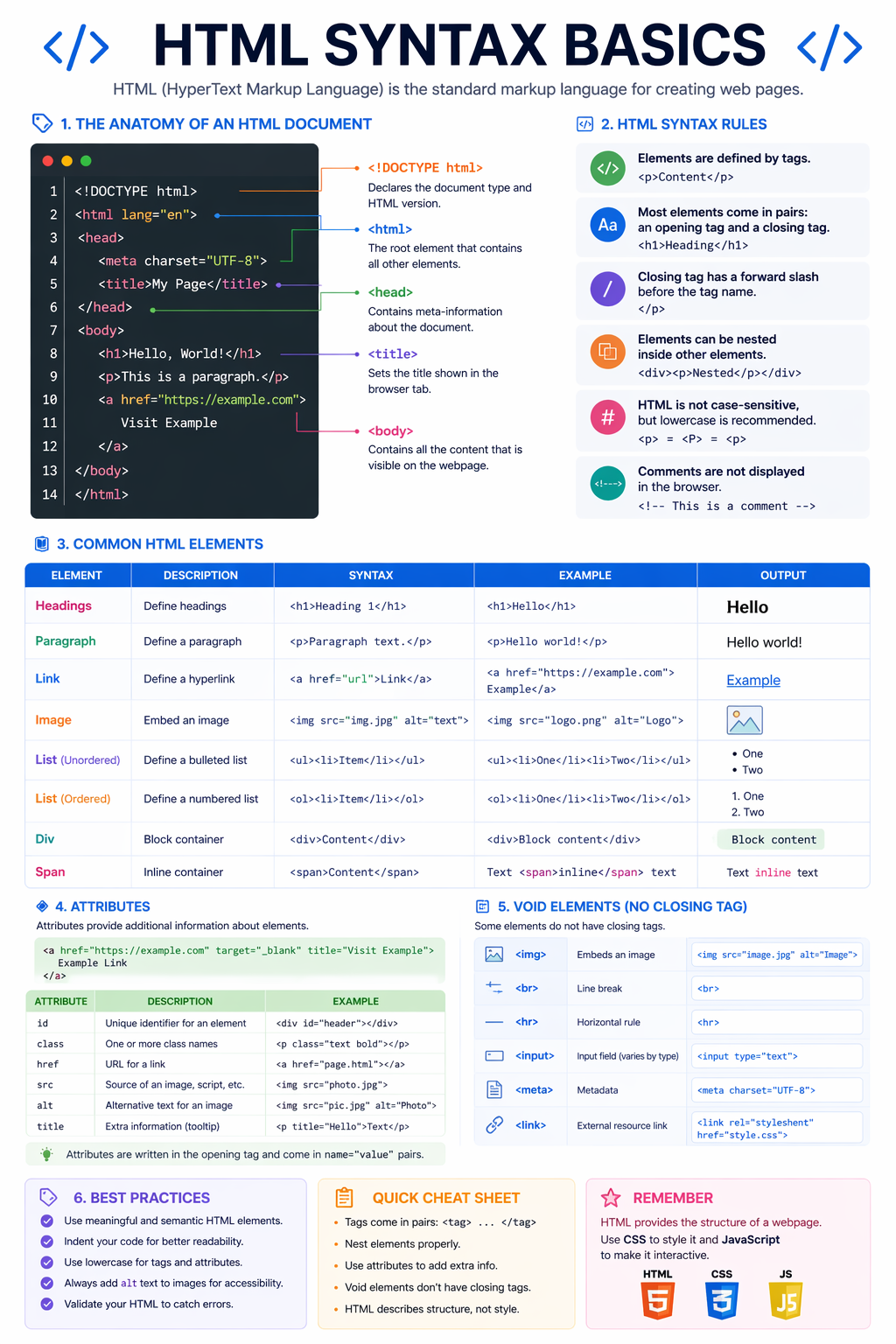

HTML5 Basics
HTML Syntax Basics
Learn the basic HTML document structure, common elements, attributes and syntax rules.
Visual Learning
Explore clear visual guides designed to explain structure, styling, and responsive front-end ideas in a practical way.

Gallery
Click any infographic to open it larger and inspect the details clearly with zoom and drag.
Step 1
Start with the core structure of HTML and CSS before moving into layout systems and responsive techniques.
HTML5 Basics
Learn the basic HTML document structure, common elements, attributes and syntax rules.
CSS Basics
Understand selectors, declarations, properties, values and the basic structure of CSS rules.
Semantic HTML
See how semantic HTML creates clearer page structure for users, browsers, accessibility and search engines.
HTML and CSS
A visual overview of how semantic HTML and CSS work together to create structured webpages.
Step 2
Learn how to organize files, name components properly, and control spacing, positioning, and layout.
Project Structure
Understand how professional project folders help keep HTML, CSS, JavaScript and assets organised.
CSS Architecture
Learn how Block Element Modifier naming keeps components clearer, reusable and easier to maintain.
CSS Foundations
Learn how content, padding, border and margin control the real size and spacing of elements.
CSS Foundations
Compare absolute and relative CSS units so spacing, sizing and typography scale more professionally.
Layout Control
Understand static, relative, absolute, fixed and sticky positioning for stronger layout control.
Layout System
Learn one-dimensional layout control for rows, columns, alignment and flexible component spacing.
Layout System
Learn the foundations of two-dimensional grid layout for professional page structure.
Layout System
Continue CSS Grid with more practical layout patterns, placement and responsive structure.
CSS Logic
Learn how browsers decide which CSS rule wins when multiple selectors target the same element.
CSS Selectors
Understand interactive states and generated styling hooks such as hover, focus, before and after.
Step 3
Understand how layouts and images adapt across mobile, tablet, and desktop screens.
Responsive Design
Learn how media queries adjust layout and styling across mobile, tablet and desktop screens.
Responsive Media
Learn how responsive image planning improves loading speed, sharpness and layout stability.
Step 4
Finish with accessibility and Search Engine Optimization foundations that make websites more usable and discoverable.
Accessibility
Learn practical foundations that make websites easier to use with assistive technologies and keyboards.
SEO Foundations
Understand the basic page structure, metadata and content clarity that support discoverability.